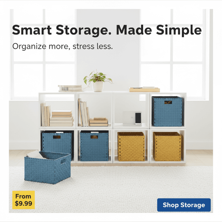
AI IKEA-Style Smart Storage Ad
View an AI-generated smart storage social media ad made from IKEA-style home retail guidelines.
Example breakdown
Why it stays on-brand
The ad keeps the bright Scandinavian retail style, practical product focus, and blue-yellow accent system from the guidelines.
Marketing use
Use it for home storage campaigns, retail social ads, product category launches, or ecommerce merchandising.
Prompt
Bright IKEA-style social media ad for a smart home storage solution. Show a clean Scandinavian living room with modular shelving, storage baskets, and organized everyday items. Use a bright white background, natural wood textures, IKEA blue and yellow accent details, and soft daylight. Keep the layout clean, practical, and product-focused. Use bold sans-serif typography and short benefit-led copy. Headline: "Smart Storage. Made Simple." Supporting text: "Organize more, stress less." Add a simple CTA like "Shop Storage". The overall visual should feel functional, affordable, warm, and approachable. Avoid luxury styling, cluttered layouts, dark themes, or overly decorative design.
How this was generated
Brand DNA came from written guidelines using the same style of preset as in the live app. That DNA was applied as rules on top of the prompt used for this asset (shown in the Prompt section above).
- 1Written guidelinesBrand DNA source
Guidelines path: BrandGen turns pasted or typed brand specs into structured DNA.
Preset exampleIKEA-Style Home Retail CampaignColor Palette
- Primary: IKEA Blue #0058AB
- Secondary: IKEA Yellow #FBD914
- Base: White #FFFFFF
- Text: Charcoal Black #111111
- Support Neutral: Light Gray #EDEDED
- Optional Warm Neutral: Soft Birch Beige #DCC9A3
Typography Bold, clean, highly readable sans-serif. Headlines should feel practical, friendly, and confident, inspired by IKEA's extra-bold geometric logo style. Supporting text should be simple, functional, and easy to scan. Avoid decorative or luxury-style typography. IKEA's identity is closely associated with a bold Futura-style wordmark and IKEA Sans in broader brand use.
Style Scandinavian, functional, bright, approachable, modern, affordable, and solution-oriented. The overall feel should be clean and useful, with a warm everyday-home atmosphere rather than a luxury or overly corporate mood.
Composition Use clean grid-based layouts with generous whitespace. Keep a clear focal point on the product, room setup, or lifestyle scene. Layouts should feel organized and easy to understand, with strong hierarchy and room for simple copy and CTAs.
Imagery Photography-led visuals showing real home environments, organized spaces, furniture in use, and relatable everyday living. Prefer bright lighting, natural tones, lived-in rooms, and practical home solutions. Product shots should feel clear, honest, and lifestyle-connected.
Visual Elements Use simple graphic blocks, clean iconography, subtle highlight bars, modular cards, price-tag-style callouts, and blue/yellow accent moments. Visuals should feel helpful, not decorative for the sake of decoration.
Do's Emphasize practical home solutions and usability. Keep the design bright, clean, and approachable. Show products in real living environments. Use short, direct, benefit-led copy. Balance product clarity with warmth and simplicity.
Don'ts Avoid dark, moody, luxury-style compositions, cluttered layouts or too many graphic effects, overly futuristic or abstract visuals, complicated typography or heavy texture, and anything that feels premium-fashion instead of accessible-home.
- 2Apply DNA to the prompt
Every generation runs through that DNA as hard constraints (colors, type, composition, tone). The creative intent is entirely in the prompt already shown above.
- 3Final outputHome & Furniture
The same wording with different DNA would look like a different brand. This image used the Brand DNA from step 1.