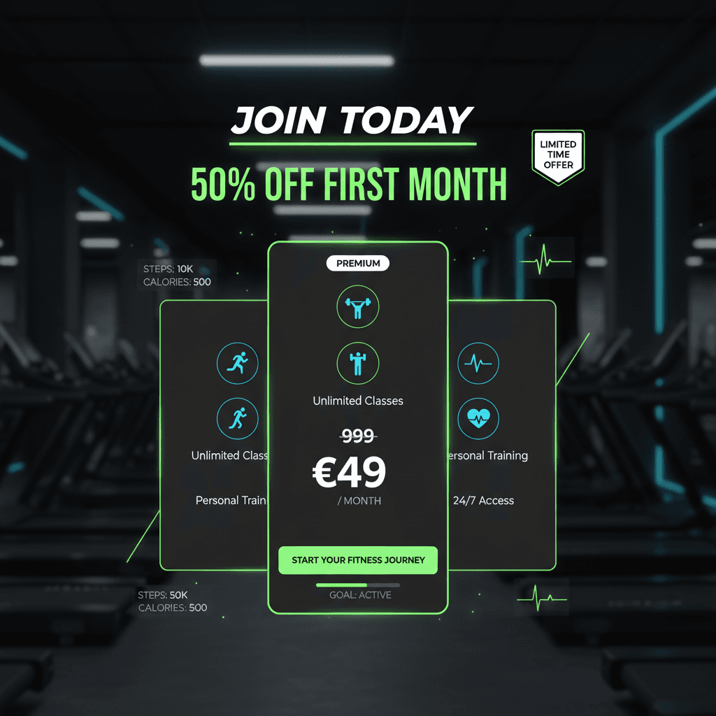
AI Fitness App Promotion Graphic
See an AI-generated fitness app promotion graphic created from written performance-brand guidelines.
Example breakdown
Why it stays on-brand
The output uses the dark fitness-tech look, neon accents, and app-focused UI elements defined in the guidelines.
Marketing use
Use it for app store campaigns, Instagram ads, product launch posts, or fitness SaaS promotion.
Prompt
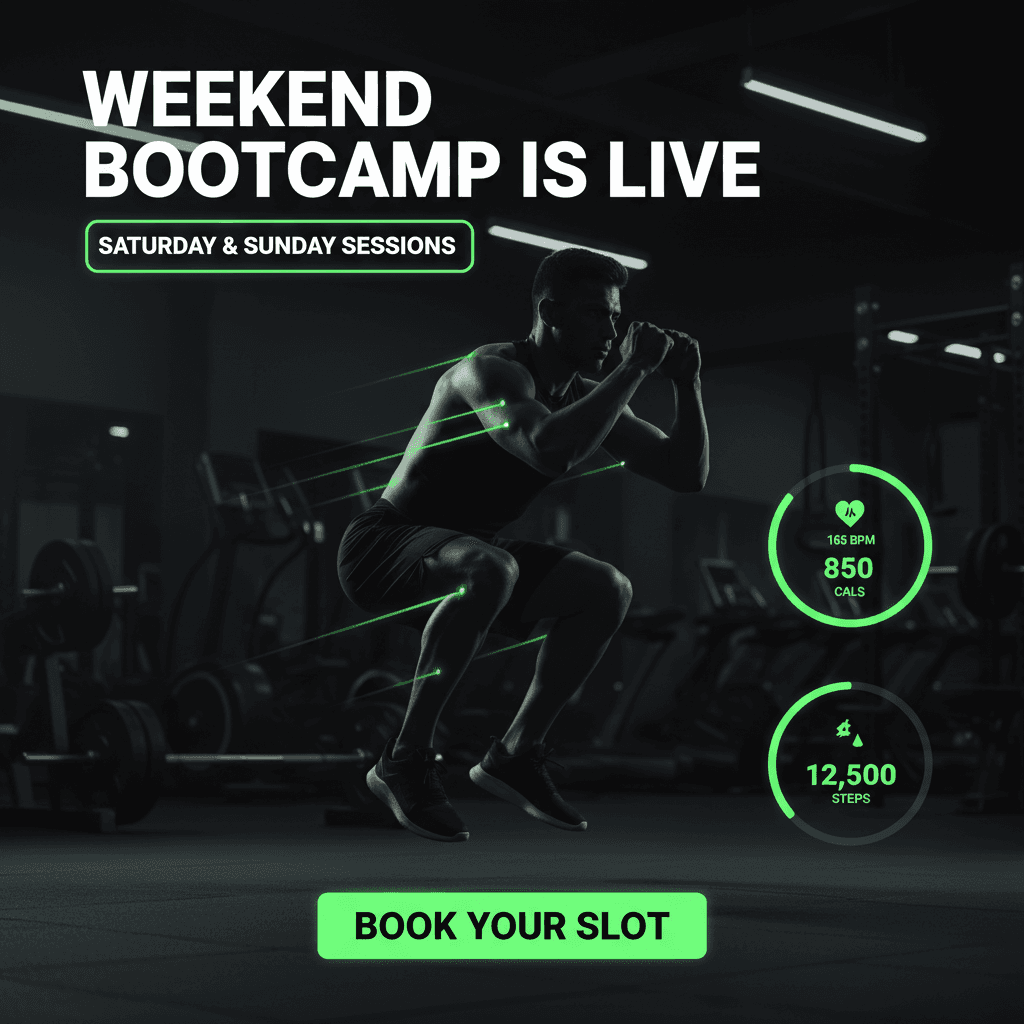
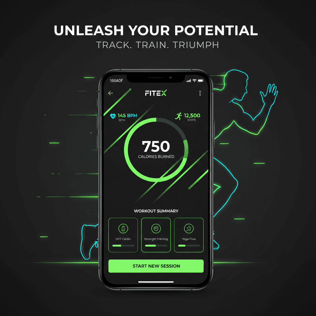
Modern fitness mobile app promotion, dark mode UI, neon green accents, athletic lifestyle visuals, bold headline, app screen mockup, energetic conversion-focused design. Show a premium fitness tracking app interface with workout stats, progress rings, heart-rate metrics, and a strong CTA button. Use a sleek black and charcoal background with glowing neon green highlights, dynamic motion elements, and a confident athletic tone. The design should feel modern, motivational, app-focused, and ready for Instagram promotion.
How this was generated
Brand DNA came from written guidelines using the same style of preset as in the live app. That DNA was applied as rules on top of the prompt used for this asset (shown in the Prompt section above).
- 1Written guidelinesBrand DNA source
Guidelines path: BrandGen turns pasted or typed brand specs into structured DNA.
Preset exampleFitness App / Performance BrandColor Palette
- Primary: Deep Black / Charcoal #050A0F
- Secondary: Dark Graphite #111827
- Accent: Neon Green #39FF88
- Support Accent: Electric Blue #38BDF8
- Text: White #FFFFFF
- Muted Text: Cool Gray #A1A1AA
Typography Use bold, modern sans-serif typography. Headlines should feel energetic, sharp, and performance-focused. Body text should be clean, minimal, and highly readable. Use strong hierarchy with large bold headlines, compact supporting text, and clear CTA labels.
Style Dark mode, high-energy, fitness-tech aesthetic. The design should feel modern, premium, athletic, and app-focused. Use neon green highlights to create momentum and action. Keep the overall look clean, powerful, and conversion-oriented.
Composition Use a strong focal point such as a mobile app screen mockup, athlete silhouette, running/training visual, or fitness dashboard UI. The layout should feel dynamic with diagonal motion, glowing accents, progress bars, performance stats, and clean CTA placement.
Imagery Use athletic lifestyle visuals such as a runner, gym training pose, smartwatch/fitness tracking elements, or app interface screens. Imagery should feel sharp, active, and motivational. Avoid cluttered gym backgrounds unless they are dark, cinematic, and minimal.
Visual Elements Use glowing neon lines, fitness stats, progress rings, calorie counters, heart-rate icons, workout cards, step counters, and app UI panels. Buttons should be bold and easy to notice. Use neon green for CTAs and key highlights.
Do's Emphasize energy, performance, progress, and transformation. Make the app interface look polished and useful. Keep the design modern, clean, and premium. Make the CTA clear and action-driven.
Don'ts Avoid bright messy backgrounds, random colors, outdated fitness stock-photo styling, cluttered layouts, weak CTAs, or too many UI elements competing for attention.
- 2Apply DNA to the prompt
Every generation runs through that DNA as hard constraints (colors, type, composition, tone). The creative intent is entirely in the prompt already shown above.
- 3Final outputFitness & Wellness
The same wording with different DNA would look like a different brand. This image used the Brand DNA from step 1.