Color Palette
- Primary: Deep Black / Charcoal #050A0F
- Secondary: Dark Graphite #111827
- Accent: Neon Green #39FF88
- Support Accent: Electric Blue #38BDF8
- Text: White #FFFFFF
- Muted Text: Cool Gray #A1A1AA
Typography
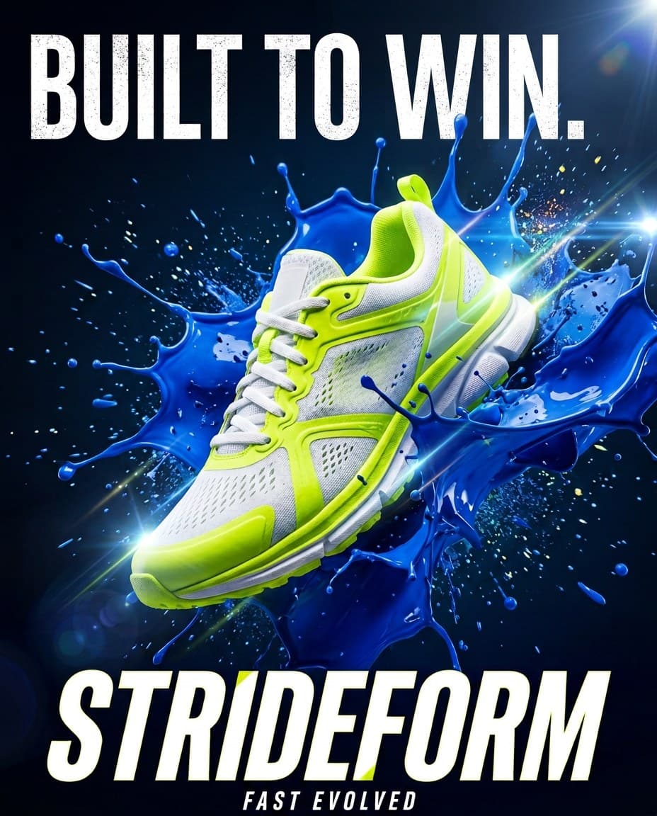
Use bold, modern sans-serif typography. Headlines should feel energetic, sharp, and performance-focused. Body text should be clean, minimal, and highly readable. Use strong hierarchy with large bold headlines, compact supporting text, and clear CTA labels.
Style
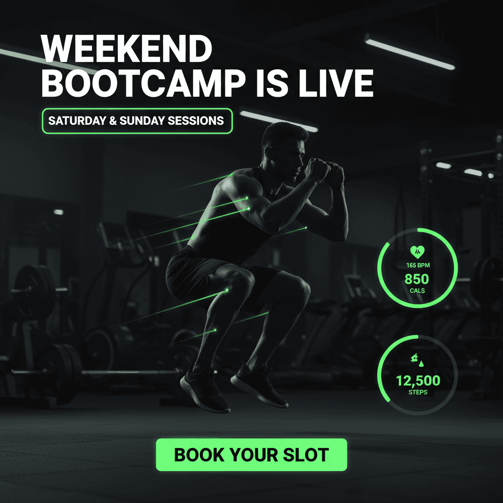
Dark mode, high-energy, fitness-tech aesthetic. The design should feel modern, premium, athletic, and app-focused. Use neon green highlights to create momentum and action. Keep the overall look clean, powerful, and conversion-oriented.
Composition
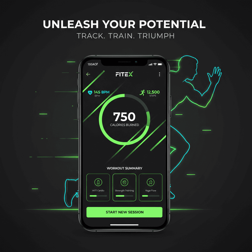
Use a strong focal point such as a mobile app screen mockup, athlete silhouette, running/training visual, or fitness dashboard UI. The layout should feel dynamic with diagonal motion, glowing accents, progress bars, performance stats, and clean CTA placement.
Imagery
Use athletic lifestyle visuals such as a runner, gym training pose, smartwatch/fitness tracking elements, or app interface screens. Imagery should feel sharp, active, and motivational. Avoid cluttered gym backgrounds unless they are dark, cinematic, and minimal.
Visual Elements
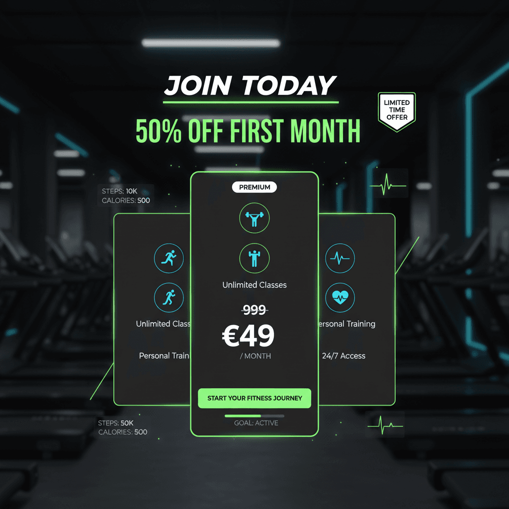
Use glowing neon lines, fitness stats, progress rings, calorie counters, heart-rate icons, workout cards, step counters, and app UI panels. Buttons should be bold and easy to notice. Use neon green for CTAs and key highlights.
Do's
Emphasize energy, performance, progress, and transformation. Make the app interface look polished and useful. Keep the design modern, clean, and premium. Make the CTA clear and action-driven.
Don'ts
Avoid bright messy backgrounds, random colors, outdated fitness stock-photo styling, cluttered layouts, weak CTAs, or too many UI elements competing for attention.